Our group teamed up with Teach for India, a non-profit that aims to standardise the education in India by raising the standards of teachers in all communities. Through “Firki”, their online portal, TFI aims to make their resources, webinars and courses accessible to teachers all around India, and not only to TFI Fellows.
In our pro-bono project, we did an evaluation of their current portal and provided our feedback to the client. For their upcoming revamp - Firki 3.0 - we also provided some design recommendations based on user surveys, contextual inquiry and visual design principles
Timeline
Coursework: 19 Days
Actual Project: Ongoing
Project Mates:
Christo Paul Naduvely
Jocelyn Wijaya
Joyce Koh
My Role
Design Systems | Client Liaison | Co-Project Manager
Tools Explored and Used
Google Surveys
Miro
Figma
Adobe XD
Invision
Methods Explored
Contextual Inquiry
User Surveys and Research
Competitive Analysis
Feature Inventory
Mid-Hi Fidelity Prototyping
Usability Testing
Photo from Teach For India
About the client
Teach For India (TFI), a partner of the global organisation “Teach For All”, is a not-for-profit organisation that aims to standardise the education in India. In a large country like India, there is a distinct wealth disparity across communities, and this directly affects the standard of education children receive in those communities.
TFI’s approach to standardise education is by raising the standards of the teachers across all communities in India. It runs a two-year fellowship that provides an opportunity for teachers to develop themselves, and to serve as full-time teachers to children from low-income communities in under-resourced schools. Once graduated, TFI “Fellows” are placed in schools where qualified teachers and leaders are highly needed.
“We place Fellows for two years in full-time teaching positions in (...) schools where poverty and other factors may limit our students’ choices in the future”
Firki
Firki is an online initiative by Teach For India which serves as a learning and growing platform for any educator across India, independent of their TFI fellowship. Adopting successful principles and strategies from TFI, Firki makes courses, webinars, collaborative learning and a huge resource bank available online for free.
“Firki is for any educator who wants to learn, is committed to providing the best opportunities for each of their students and most importantly loves to teach!”
How Firki supports teachers' development. Infographic from Firki.co
About the Project
Our client is planning on having a major revamp of the online portal, dubbed as “Firki 3.0”. This major revamp consists of:
- Redesigning the website
- Recreating the information architecture
- Recreating the navigational schema of the web and mobile portal
- Recreating the information architecture
- Recreating the navigational schema of the web and mobile portal
To align with their target of improving user friendliness of the portal, the client wanted some input and direction from User Experience Designers.
Throughout the duration of the project, our client wanted our help with the following tasks.
1. Provide an evaluation of the current website and app by User Experience Designers, from the perspective of a first time user.
2. Provide recommendations on the changes that can be considered for Firki 3.0
Photo from Teach For India
Initial Impressions and Evaluations
From our client interactions, we knew that the website has courses, resources for teachers to use, and some webinars available for the teachers to attend.
The four of us conducted our initial evaluations, based on how we would use the website to arrive at a particular course, resource or a webinar.
I summarised our major findings into the following categories
Readability
We felt that the font weight, sizing and the text-color contrast across different pages were could be worked on to improve readability.
Light-weight font was being utilised extensively. Successful for headers, light-weight font affected the readability of the smaller-sized body text. This will cause users to put in more effort to read the content on the page.
Apart from the light-weight font, colour contrast has also been affecting readability. Having lighter shades of colours, or deep grey (in case of filter choices) removes the distinctness of the text in the foreground.
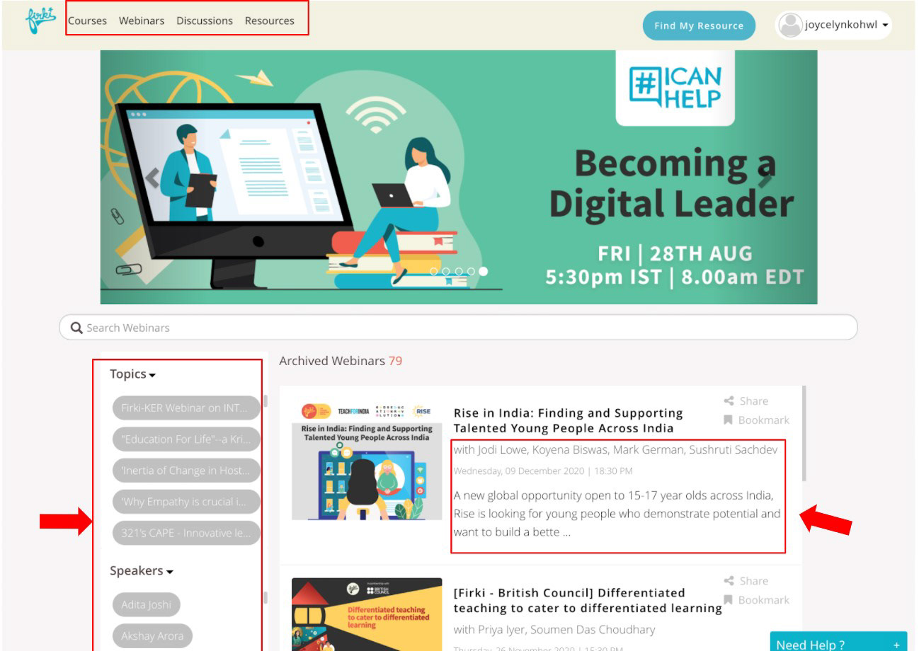
Webinars Page on Firki. Thin font on deep grey affects the readability of the filter buttons
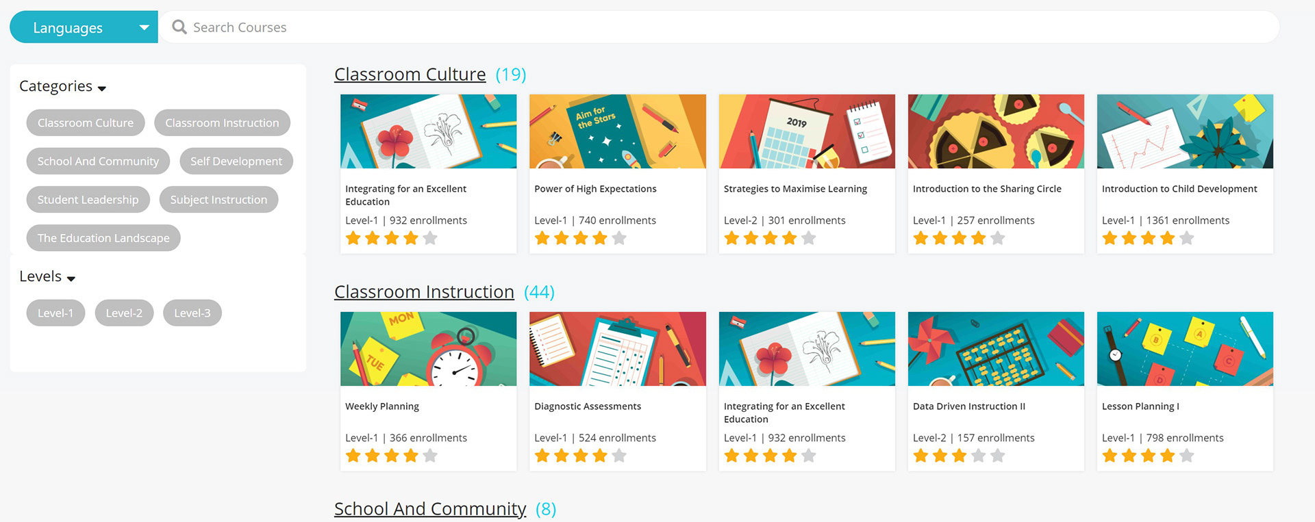
Courses Page on Firki. Small font of the course titles does not engage the user immediately.
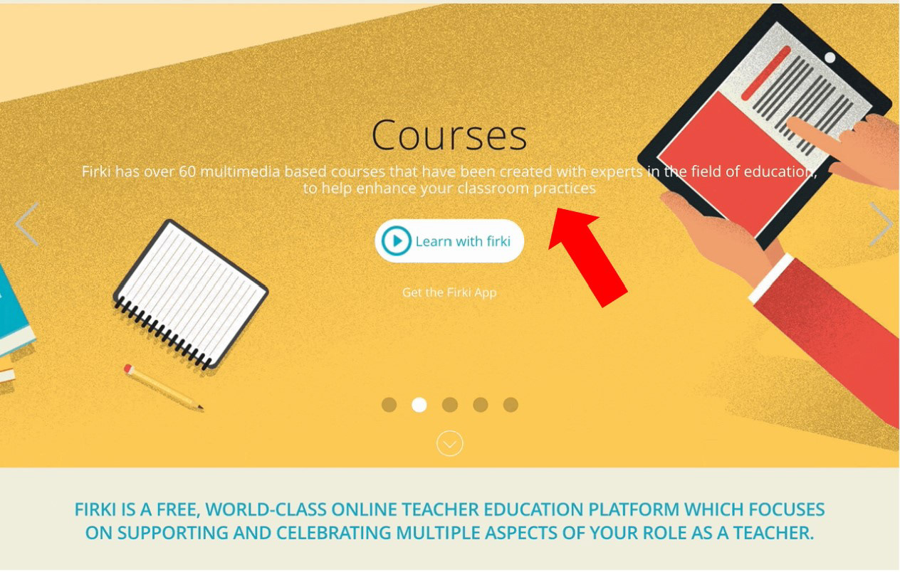
Hero banner on the Landing Page.
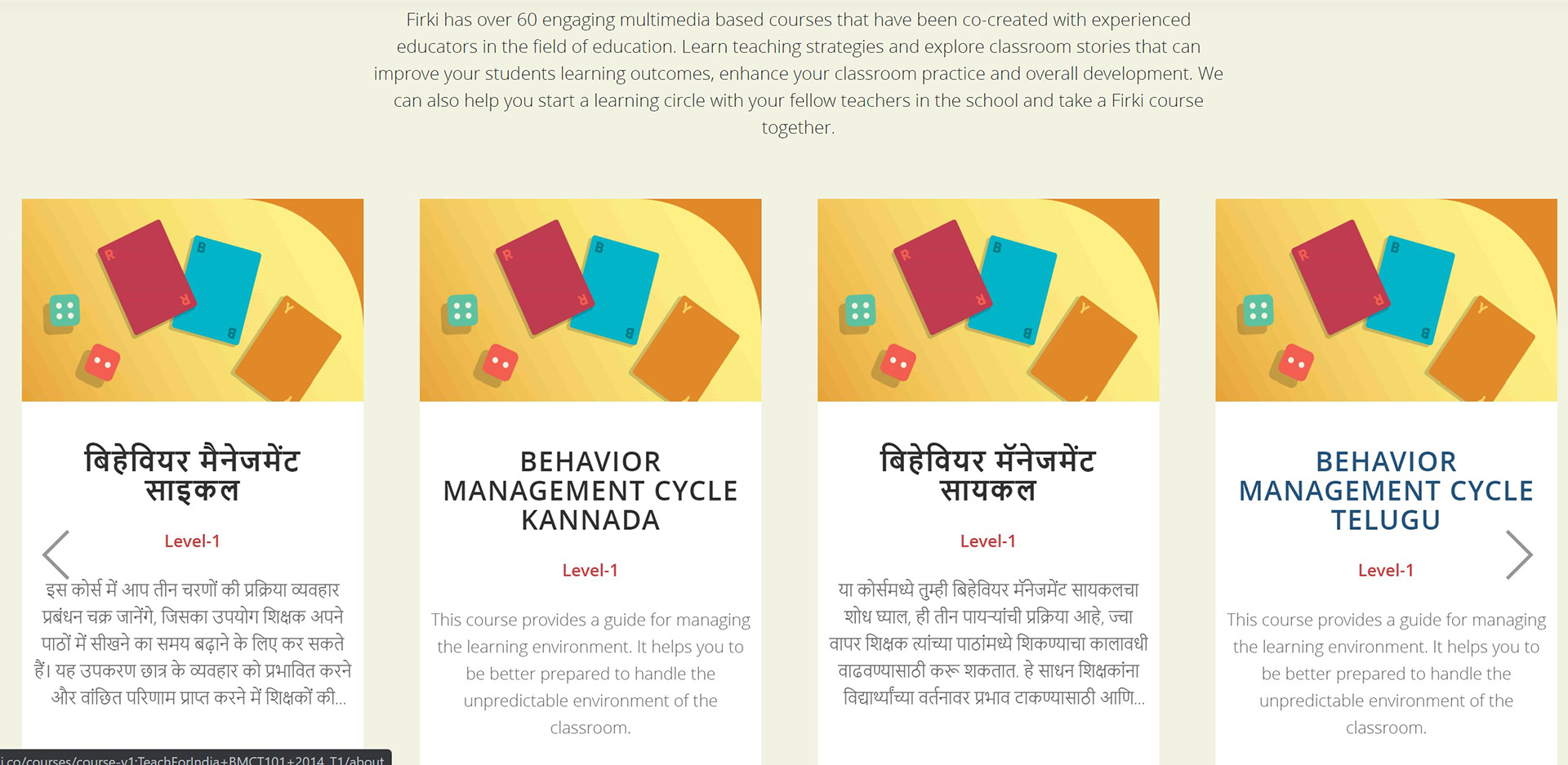
Text blocks on the Landing Page. Big blocks with thin font does not keep the users' attention on the text.
Navigation
1. Users find it hard to locate themselves across the website.
On the navigation bar, there is no indication as to which choice is selected (red arrows).
On various pages, there is a lack of page descriptive headers (blue arrows).
Users are forced to infer which page they are on based on the content of the page itself.
2. Users find themselves having to go through multiple clicks to perform certain functions. Each subsequent click does not depend on users' previous choice.
To view a course, users have to click "View Course" more than once. They will only reach the course view page after going through web pages that contain repetitive choices.
While engaging with "Find my Resource" feature, the three questions appear in different screens. Each of the choices are in a drop-down menu, which the user has to click to access.
Content Organisation
A lack of proper metadata creation has led to users unable to efficiently filter out the content on the website.
Resources have been uploaded with "file name" as their title. Information such as
- lesson number (green underline),
- resource title (blue underline),
- language (red underline),
and others have merged into the file name.
- lesson number (green underline),
- resource title (blue underline),
- language (red underline),
and others have merged into the file name.
Users are unable to filter resources with respect to the above fields, or able to sort them in a sensible order to find the resources they need.
Help and Documentation
For first-time/rare users, Firki's lack of help and documentation would pose some difficulty in using the website for its purpose.
Firki has a feature called "Learning Circle" on its website. It is aimed at increasing peer-to-peer learning and collaboration by connecting similar teachers across India.
However, there is no documentation or explanation of how this feature works anywhere in the screens associated with the feature, or anywhere in the website.
Photo from Teach for India
User Survey
With our initial findings, I set out to get impressions and insights from the actual users of Firki - teachers and TFI Fellows in India.
Due to time difference and busy schedules, I had to send out surveys in-lieu of user interviews.
I created the survey such that we could better understand the users’ awareness and usage of Firki's features.
Of the respondents, 50% have been teaching for more than 7 years.
About 37.5% have less than a year of teaching experience
Firki is definitely relevant to new and experienced teachers who are looking to improve themselves.
Insights
- Most users use Firki once a month: ease of use and user familiarity of the portal is important
- Users do see a need for a search bar and filters when they want to find courses and resources: content management needs to be refined
- Firki has an enormous resource bank that is accessible by all but it's suffering from a lack of awareness: "Resources" feature needs to be better integrated and made prominent
- Users do not fully understand or track their learning progress from the Dashboard: make learning progress statistics simpler and more relevant
- Discussions, specifically "Learning Circle", was not intuitive for users to use. Client mentioned that users had to be physically taught on how to use "Learning Circle".
Design Recommendations
Of the respondents, 50% of them exclusively use Firki's website.
We decided to focus our current redesign recommendations on Firki's website.
We provided recommendations on the various static webpages. In doing that, it was ensured that we made changes based on:
- Our initial evaluation
- Usage patterns
- Client's future direction
- Usage patterns
- Client's future direction
Homepage
To improve readability of the text, we've improved the colour contrast, and reduced the usage of light-weight font.
The four main features of Firki:
- Courses
- Webinars
- Resources
- Discussions
are also visible on the homepage, in a bid to increase awareness amongst users and to let them know what to expect on the portal.
- Courses
- Webinars
- Resources
- Discussions
are also visible on the homepage, in a bid to increase awareness amongst users and to let them know what to expect on the portal.
Courses
Course Card: Client required certain information to be present on each course card
- Course Title
- Course Contributor
- Tags: New/Popular/Featured
- Enrolment
- Course Title
- Course Contributor
- Tags: New/Popular/Featured
- Enrolment
Filters: Included a new field "Offered By". In future, Firki will include third-party content.
On the left side - standard across website
On the left side - standard across website
This page is accessible directly by clicking on a course card, eliminating the need for multiple clicks to view a course.
Integration: Resources, Journal Pages and Discussions specific to this course is readily accessible on this page.
Other changes are recommended based on EdTech practises.
Resources
Aside from integrating resources into courses, we recommended changes directly on the Resources page. With over 2300 resources, users will now be able to explore resources with ease.
Filters: Also on the left side of the page. By introducing standardisation across FIrki's webpages, users will not have to keep re-learning how to use Firki.
Table: Now has distinct columns that will be populated with each resource's metadata. Users can now sort accordingly, and explore through Firki's resource bank
However, to properly take advantage of the new Resources table, each resource needs to be properly tagged with distinctive information.
I created a format in which the client must build a metadata for their resource bank.
Discussion
As seen from survey results, majority do not use Firki's discussion platform. From client interactions, "Discussions" mainly refer to "Learning Circle", which hasn't had much reception amongst Firki users.
In Firki 3.0, client wants to introduce a new feature "Learning Paths". Thus, we suggested to create distinct features:
- Discussions: As a platform for discussing on topics and courses
- Learning Circle + Learning Path as an independent feature
- Learning Circle + Learning Path as an independent feature
My Topics: Topics user has participated in. Allows users to revisit any past discussions
Other Topics: Users can find topics based on what they want to find out.
Portal
Firki 3.0 wishes to better integrate the four features of Firki. One of the ways we suggested was to have a Portal, unique to each user.
This portal will now merge the following content:
- What's New: Client wants users to be updated of new courses, resources or webinars
- My Activity: Similar to existing feature, users can access their enrolled courses and webinars, and access a future feature "Learning Paths". Users will also be able to track their progress on this page directly.
- My Resources: Users can access their saved resources
- My Certificates: Firki 3.0 onwards, users will get certificates based on completed courses. They can access them here.
- My Badges: We introduced this feature for the users to have a fun sense of achievement as they progress in their learning process
This is how a user can navigate through our new, more comprehensive Portal.
Navigation
Per client's direction of increasing peer-to-peer collaboration, discussions are now readily available on the navigation bar.
We also standardised the navigation bar, and made changes based on our initial findings.
We recommended having an introductory text on each feature page. User will be able to know which page they are on, and what to expect on that page.
Final Thoughts
This project definitely differed from the previous three school projects. The real test came when we had to improvise our schedule while reacting to real-world factors such as client accommodations, time difference (as the client and the users were based in India).
As the client liaison, I was able to play on my soft strength of customer handling. I quickly established a rapport with our client, Ashwath, and we worked with ease throughout the three weeks.
"You'll be part of a project that has the potential to help millions of teachers and students from all walks of life around India"
Teach for India does work that is noble and inspiring, affecting millions of teachers and students across India. The revamp of their online portal, Firki 3.0, did not end with the end of our coursework. And so, we are still working with Ashwath in helping out as much as we can in their design process.
