As Product Manager, I worked in a multidisciplinary team to ensure that the Zenyum App remains as the primary way for Zenyum's Aligner Patients to self-administer and monitor their Aligners treatment. The retained patient engagement had proved to be imperative in the growth of Aligner sales through Referrals, growth of Zenyum's Retainer sales, and had supplemented the growth of Zenyum's Consumer Product business.
Throughout my time on this product, I increased the Patient app's DAU/MAU from an average 17% to about 27%.
In this page, I've covered highlights of my work on the Zenyum App. Scroll below!
Who I've worked with on this Product:
Creative and Product Design:
For app visuals and aesthetics
For app visuals and aesthetics
App and BE Development:
To build, develop and release the new designs
To build, develop and release the new designs
UX Researcher:
To work on UX flows, research, ideate and validate
To work on UX flows, research, ideate and validate
Dentistry:
For content gathering and validation
For content gathering and validation
Customer Care (CC):
To understand patient psyche along the journey
To understand patient psyche along the journey
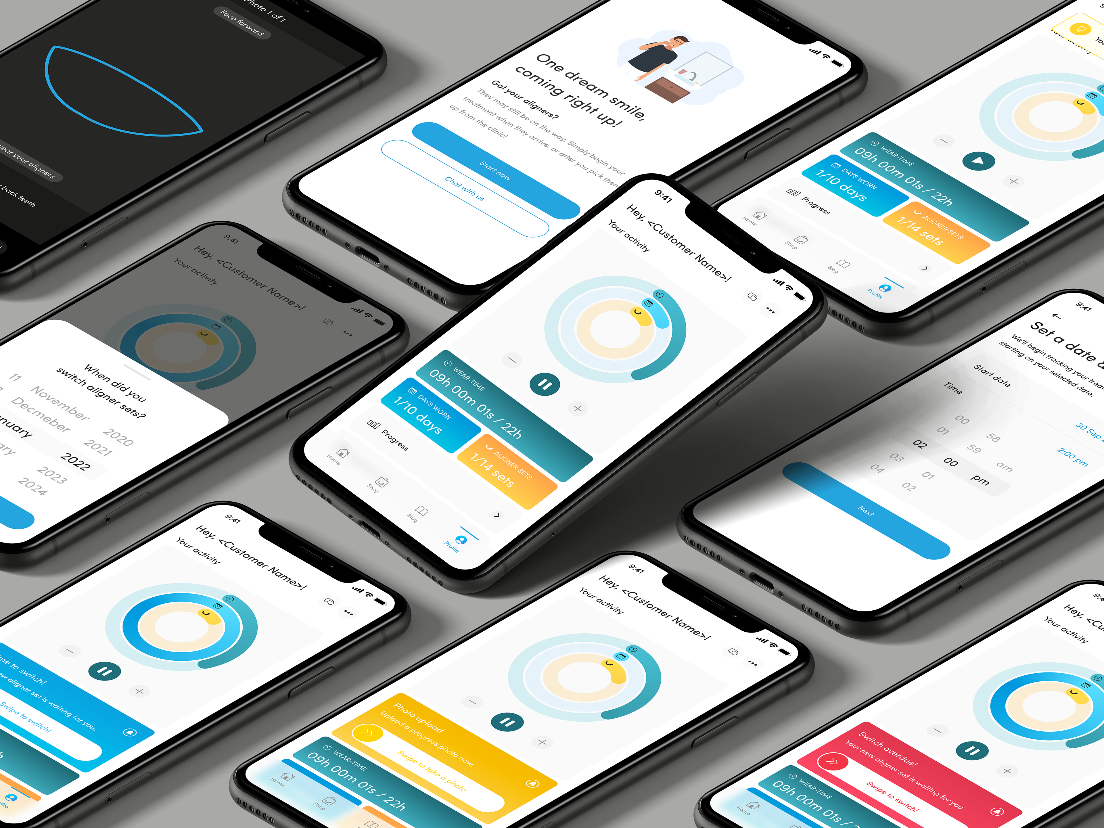
Treatment Monitoring Dashboard revamp
Together with the various teams, I redesigned the TM dashboard to work on a patient’s engagement on the app.
Last updated in 2020, the Patient app needed a refresh to reflect Zenyum's updated brand identity. However, we took the opportunity to study patients' usage patterns, expectations and problems that they have faced with the Zenyum app.
We went through multiple rounds of design discussions, validation on the content and patient flow with stakeholders, and the changes required with the development squad. Ultimately, we arrived on a major design freeze after a couple rounds of usability tests.
This revamp:
- Increased average time spent on the app from 45s to 1m 28s
- Increased on-time aligner switch rate from ~60% to ~89%
Read on for some highlights on the changes I've made.
- Increased average time spent on the app from 45s to 1m 28s
- Increased on-time aligner switch rate from ~60% to ~89%
Read on for some highlights on the changes I've made.
---
Aligner Wear Time Tracker and Viewer
This tracker allows patients to track their Aligner Wear Time for the day, and also view the past wear time patterns. We conducted these changes in an iterative manner. Doing so, we were able to prioritize our resources based on success of each iteration and rethink our further solutions if we had seen a differing usage patterns.
Goal
To design such that patients intuitively understand their progress through the least cognitive load
First Iteration: After the redesign, we started with an average Timer Usage/DAU % at 20.8%
To design such that patients intuitively understand their progress through the least cognitive load
First Iteration: After the redesign, we started with an average Timer Usage/DAU % at 20.8%
Iterative Changes
Only after usage went up and we saw the demand for a historical view, worked on deploying the wear time history feature (aka Second Iteration)
- When the average usage went up to 25%, decided to take up past wear-time viewer
- When the average usage went up to 25%, decided to take up past wear-time viewer
Brought up the average usage to only ~27%, that's when we realized that patients needed a way to correct their past wear-time as well (aka Third Iteration)
- After releasing past wear-time editor, average usage went up to 30%
- After releasing past wear-time editor, average usage went up to 30%
Based on further usage pattern study, deployed a mini-wear time widget on the app’s home screen (aka Fourth Iteration)
- Average usage among daily users further went up to 33%
- Average usage among daily users further went up to 33%
Finally, to help patients remember to track their wear-time accurately, I created a journey on Braze to prompt timer usage among patients who may have forgotten to use the timer during the day
Impact: The Aligner wear timer usage increased to 37% of all Daily users.
---
Patient's Journey Screen
Codenamed "Candy Crush Saga", this was a solution borne out of a need for workflow efficiency
A research into improving workflows for Customer Care (CC) showed that the representatives had patients each day asking on what to expect next in their treatment. Spending an average of a minute per patient, there was a cumulative of average 1-2 hours a week taken to respond repetitive information.
User research showed that patients are
- Excited at the start to know how their treatment is going to be like
- Eager to know at end of their treatment, more details on how they are going to offboard
- Eager to know at end of their treatment, more details on how they are going to offboard
Build and Iterative Changes
Hence we ideated and built a Treatment Journey on the patient app for patients, validated by usability tests and Dentistry teams on the content.
- Patients are able to view their past steps leading up to their current status
- Patients are also able to view explanations of their future steps
- Patients are also able to view explanations of their future steps
We first released the journey screen in one market. In the first 4 weeks:
- Time spent by CC Reps decreased to maximum 5-10 minutes a week
- There was an engagement rate of 7.6 clicks per week among patients in the early half of their treatment, however
- Engagement rate among patients in the later half of their treatment was 44.3 clicks per week
- There was an engagement rate of 7.6 clicks per week among patients in the early half of their treatment, however
- Engagement rate among patients in the later half of their treatment was 44.3 clicks per week
After some localization, we proceeded to release the feature the rest of the 8 markets
Impact:
- Current engagement rate stands at 293 and 199 clicks per week among early half and later half patients
- CC reps are able to use time saved on upselling Zenyum’s other products
- CC reps are able to use time saved on upselling Zenyum’s other products
---