Our group chose to explore UNIQLO Singapore as a service that has both physical touchpoints - in the form of their many, many physical stores; and digital touchpoints - in the form of a website and a mobile app.
Through the UX research process, we decided on redesigning their UNIQLO Singapore's mobile app by integrating what works well in the physical space into the digital space.
Timeline:
12 Days
Project Mates:
Julia Chung
PohLin Ong
Yvonne Yau
My Role:
UX Researcher | Interaction Designer | Model
Tools Explored and Used:
Pencil & Paper
MURAL
Figma
Whiteboard and Projectors
METHODS Explored:
Affinity Mapping
User Research
Competitive Analysis
Feature Inventory and Prioritisation
Customer Journey Map and Service Blueprint
Field Research
Mid-Hi Fidelity Prototyping
Testing and Iterative Designing
SUS
About UNIQLO
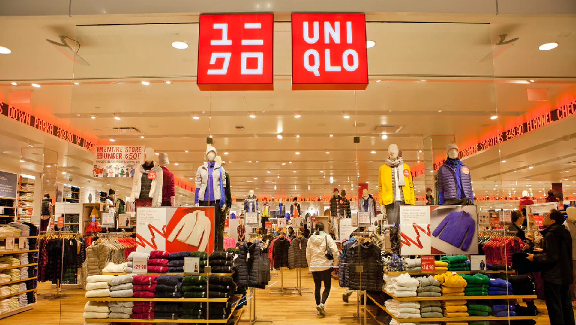
UNIQLO is a Japanese fashion retailer, with retail shops all around the world.
When tried to register as a brand, the clerk had mistakenly seen a C as a Q. Hence, what was supposed to be "uniclo" - a shortened form of "Unique Clothing", became "UNIQLO" as we now know it.
UNIQLO Singapore Flagship store at Orchard Central
With a Direct to Consumers business model, UNIQLO's goal is to increase e-commerce sales to 30% of the total worldwide revenue.
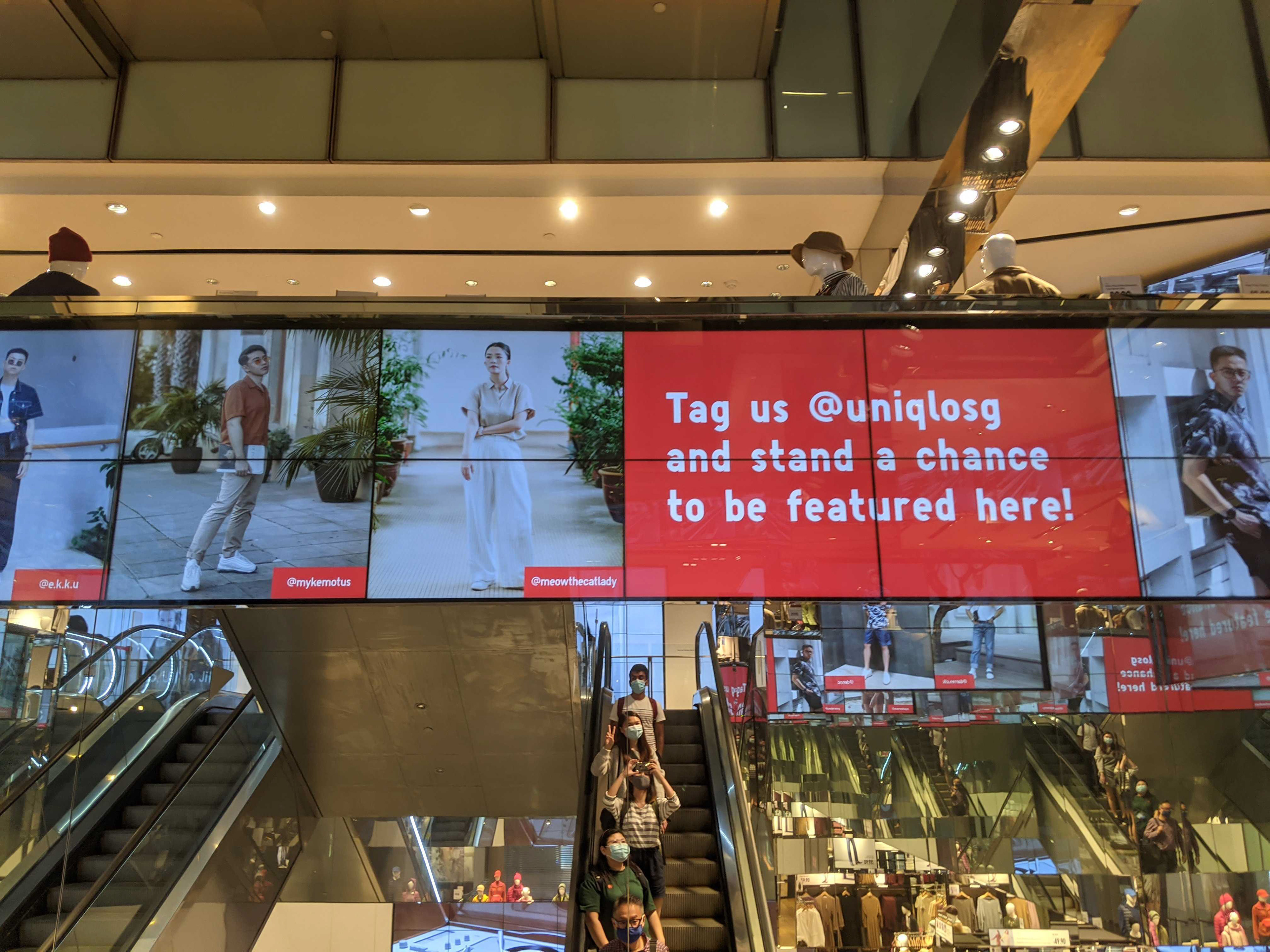
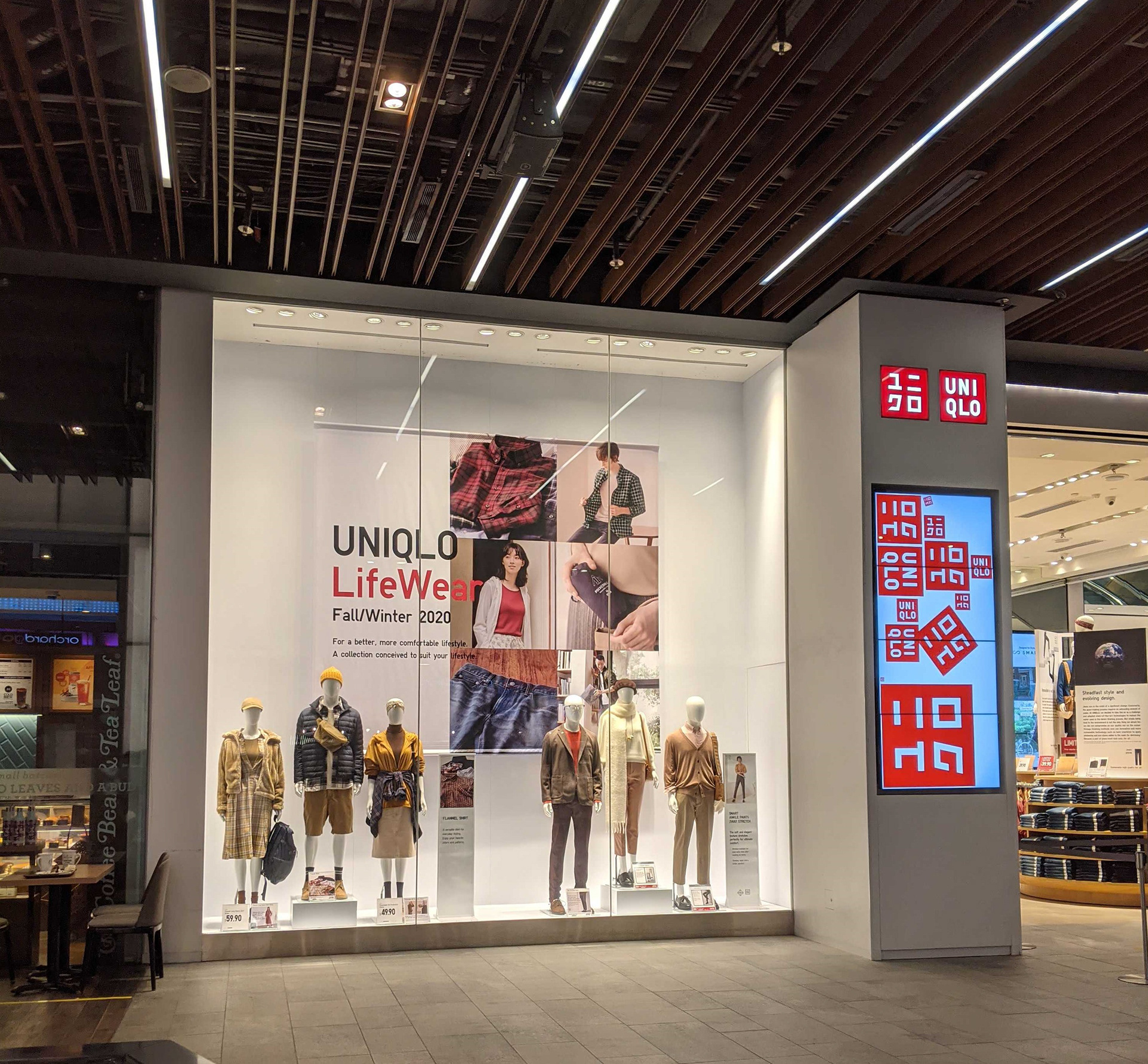
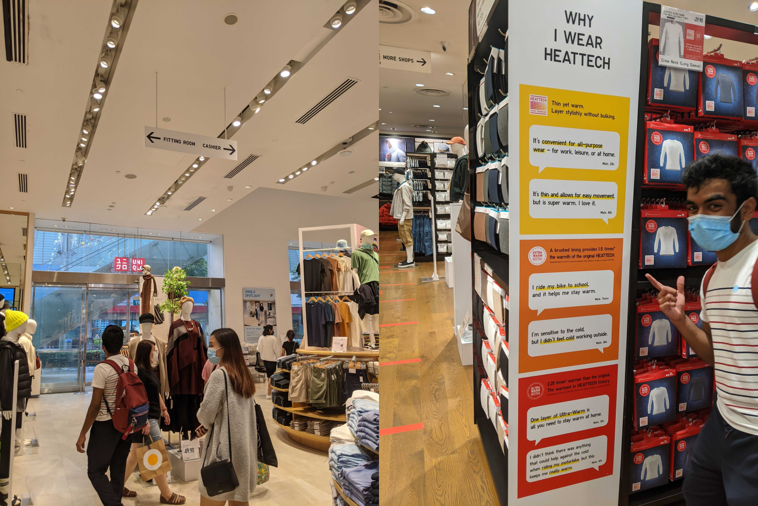
Field Trip
We were curious of how UNIQLO's physical store works. From the occasional chants of "WELCOME TO UNIQLOO" to the sheer breadth of UNIQLO's collection, we were fully immersed in the experience the whole time.
Racks were neatly organised and spacious. Staff was running around bringing neatly folded T-Shirts to their racks, and frequently you'd see friendly persons wearing the red lanyard attending to clueless customers to find what they're looking for.
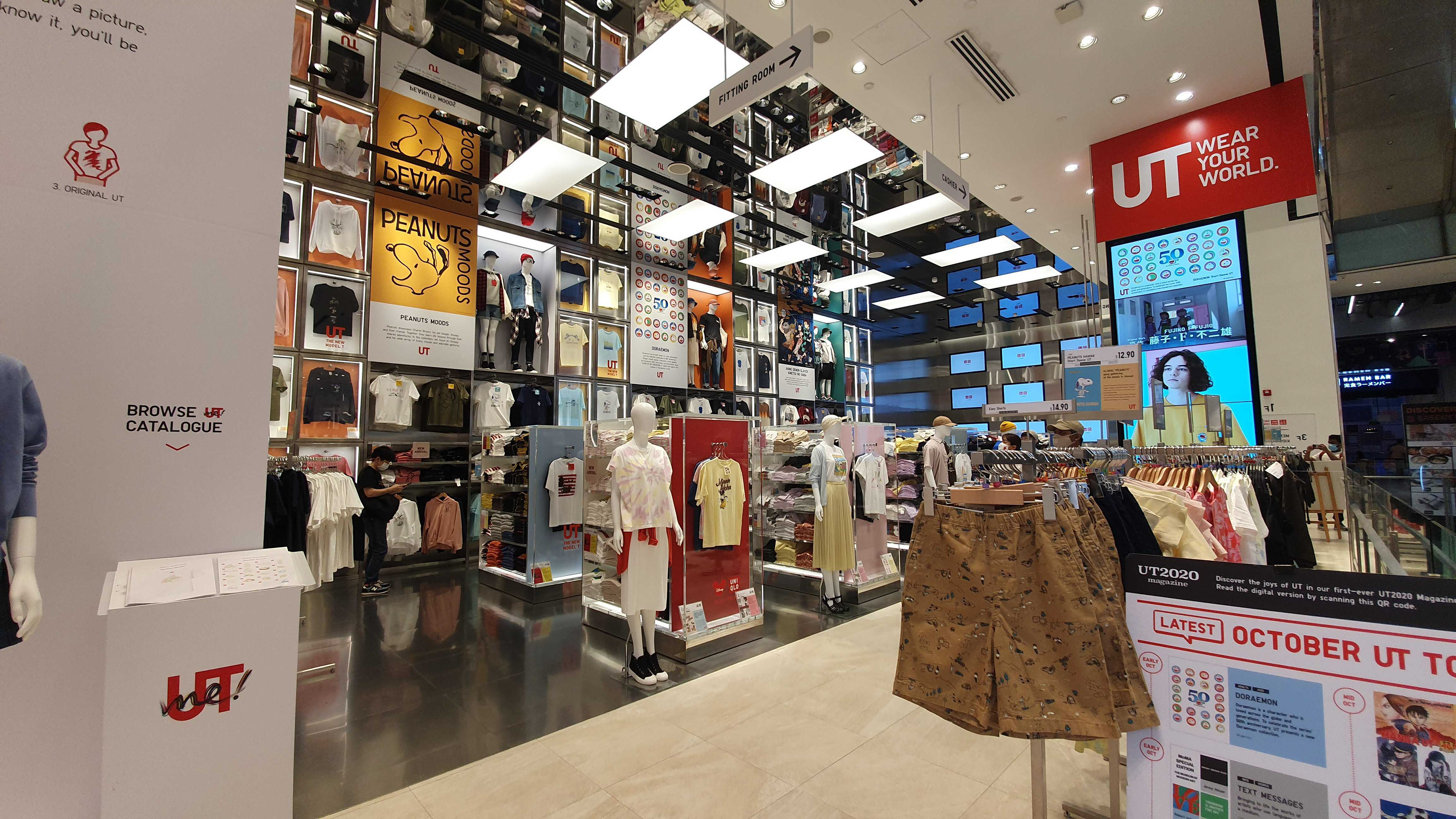
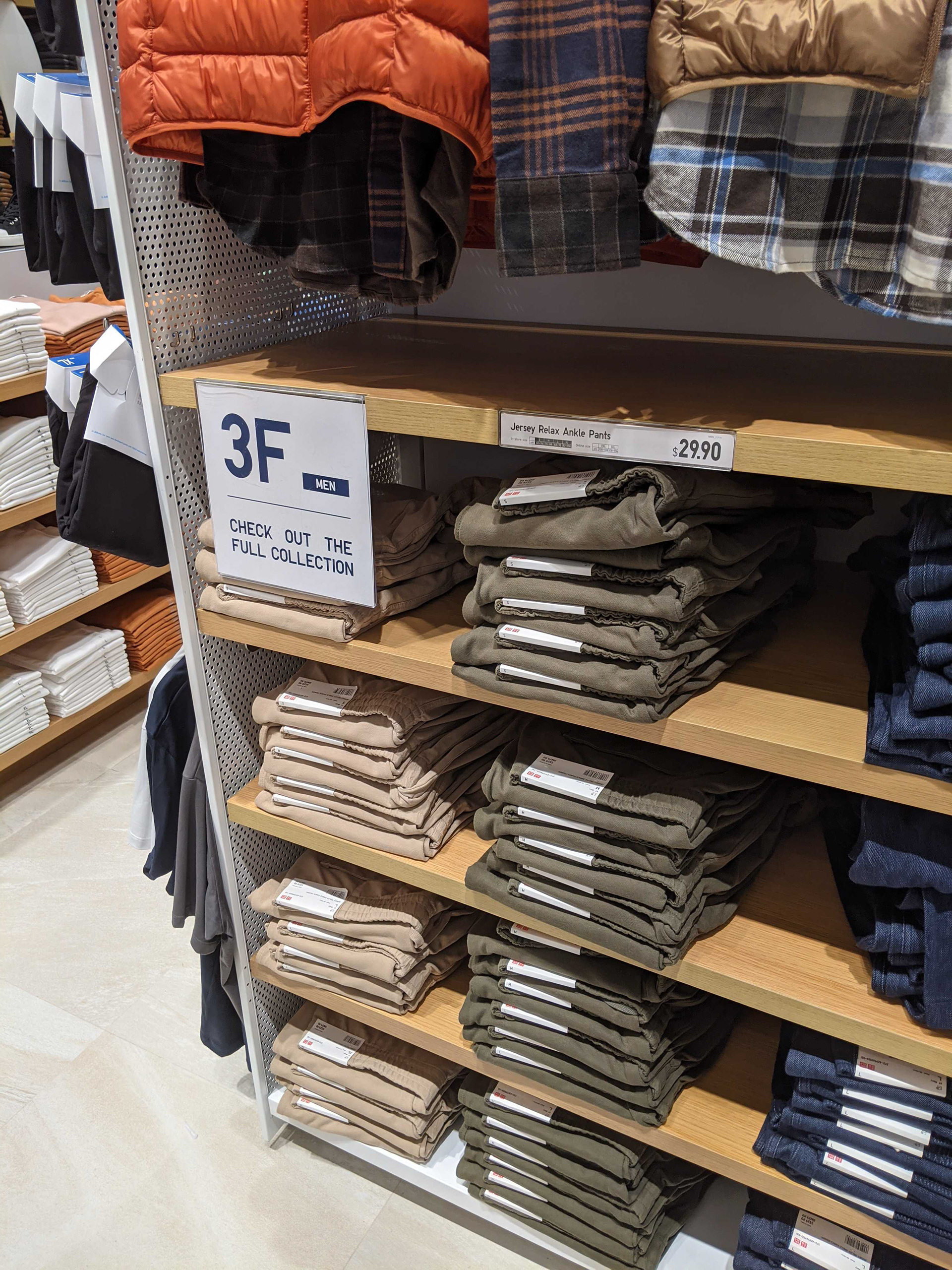
Everywhere we looked, we know our way around instantly. Signages were clear and readable. We could clearly see showcases of the range of products that have newly arrived, or are on sale.
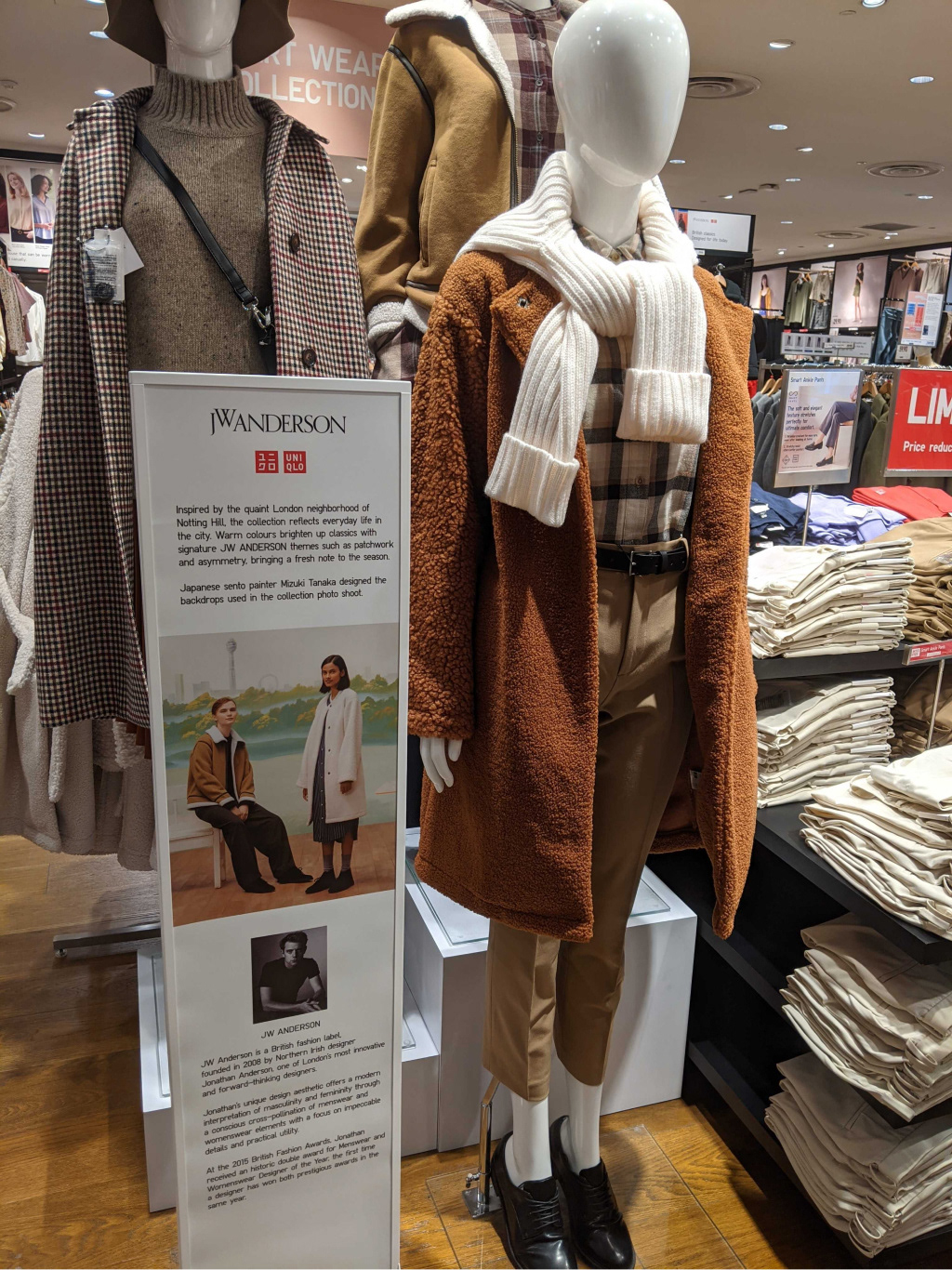
We'd also spot the occasional mannequin with a fully curated outfit, that made us want to see if we could pull off the same look.
We couldn't.
Brand Perception
We asked 13 people who have shopped at UNIQLO at least once in the last 6 months
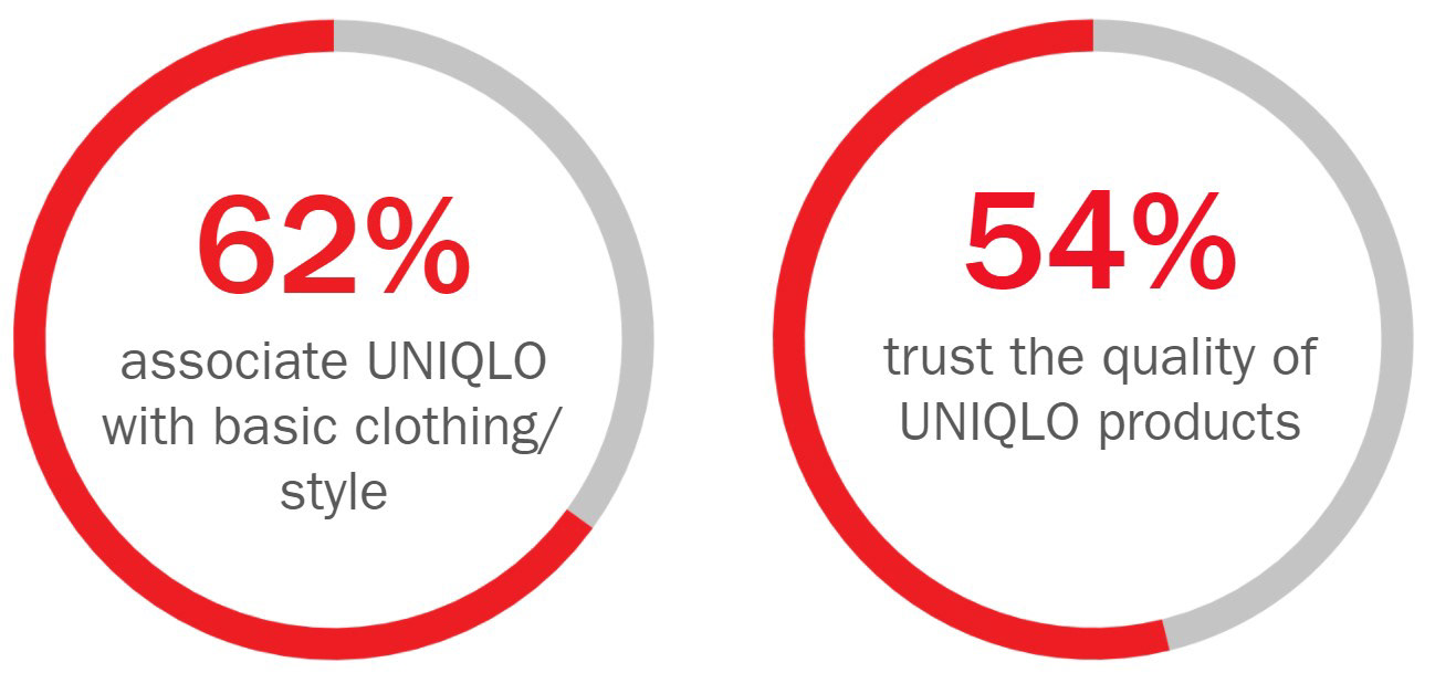
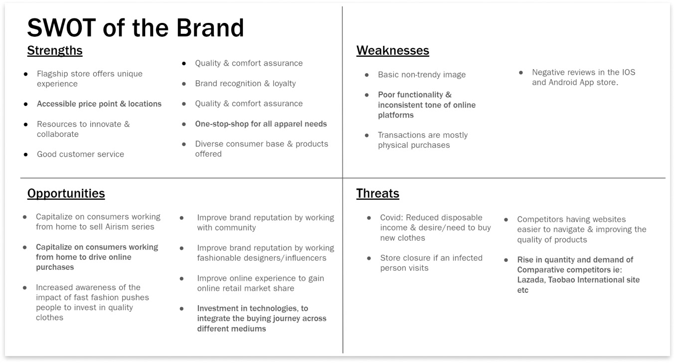
Identifying the Strengths, Weaknesses, Opportunities for growth, and Threats to the brand
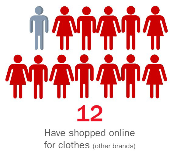
Shopping Habits
We probed about the shopping habits of the same 13 people
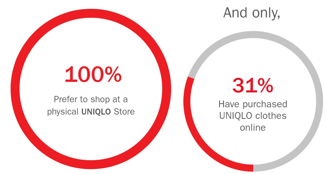
About the UNIQLO App
Seeing as how even though the respondents have a habit of shopping for clothes online, only 31% have ever purchased clothes from UNIQLO online. Curiously, we probed further on this.
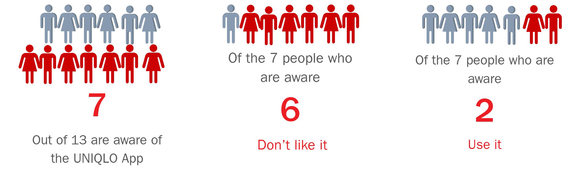
For a brand that has a strong positive customer experience at their physical stores, UNIQLO Singapore’s mobile app is performing horrendously in the same. Our research led to 1-2 star reviews on App Stores and Play Stores.
Again, we wanted to confirm the reality of this. We asked 13 people about the UNIQLO app.
Usability Testing on the current app
What went well:
Functional app interface
Allows users to browse and purchase products
What could be improved:
App is unnecessarily complex
Online store opens in a separate mobile browser
Mobile version of the desktop app is not optimised for smaller screens
Information overload
User is not signed in at the store, even though they are in the app
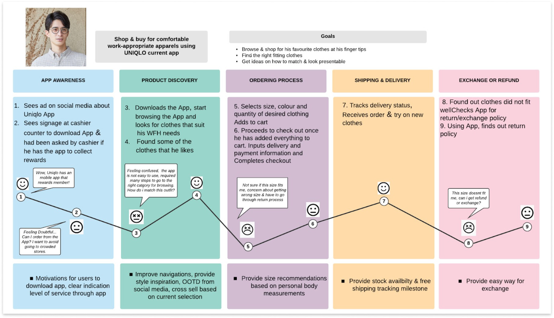
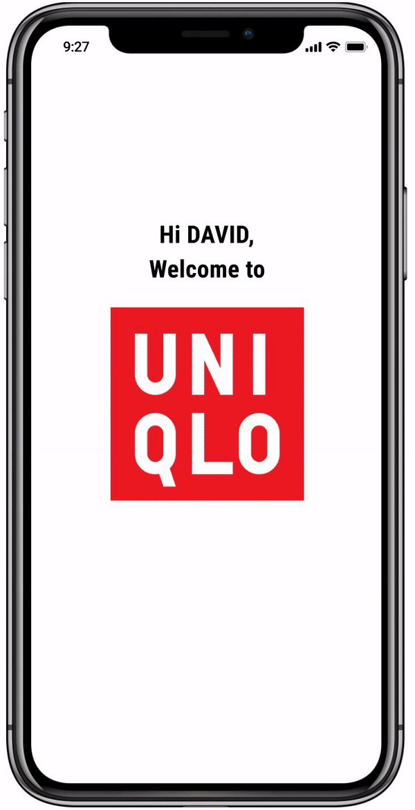
We came up with a Customer Journey Map, depicting how David, our UNIQLO customer persona, would go through the UNIQLO online experience.
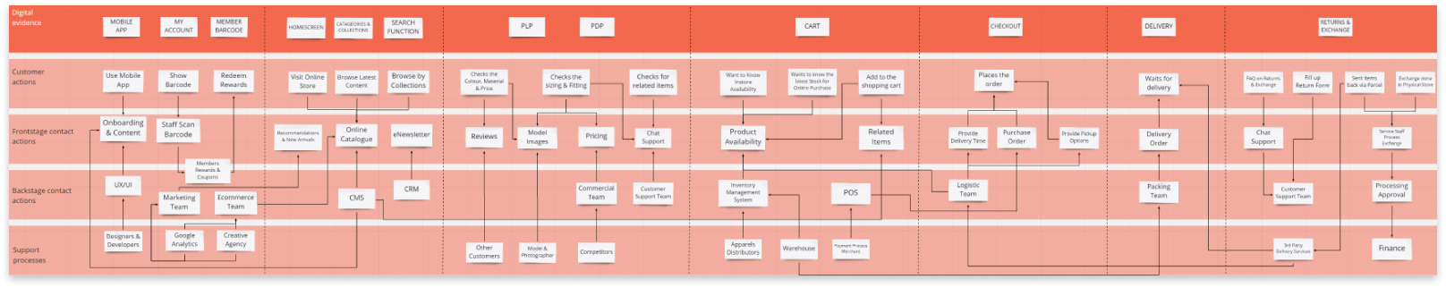
Service Blueprint for the UNIQLO Mobile Experience
At this point, we decided to work on improving UNIQLO Singapore's app, since there is much to be improved in UNIQLO's digital space
Ideation
We identified a good opportunity here to introduce some familiarity of the physical store into the app.
With a good customer experience in the physical space, we brainstormed on how we can integrate both the digital and physical touchpoints, and bring the same level of experience to UNIQLO's digital space.
Competitive Analysis | Feature Prioritisation

Direct Competitors: ASOS, Cotton On, H&M
Analogous Competitors: Lazada
We looked at the competitors' websites to know what sort of features work well, and what sort of features can be added on to the current set of functions on the UNIQLO app.
Having analysed those, we prioritised the list of features using the MoSCoW method, based on how much value they will bring to the app, how much effort will go into developing them, and how they will aid in integrating the physical and digital experiences
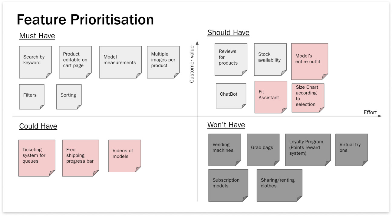
Grey: Existing features
Pink: New features being introduced
Dark Grey: Features not being developed at the moment
With that, we proceeded to build the new and improved UNIQLO app
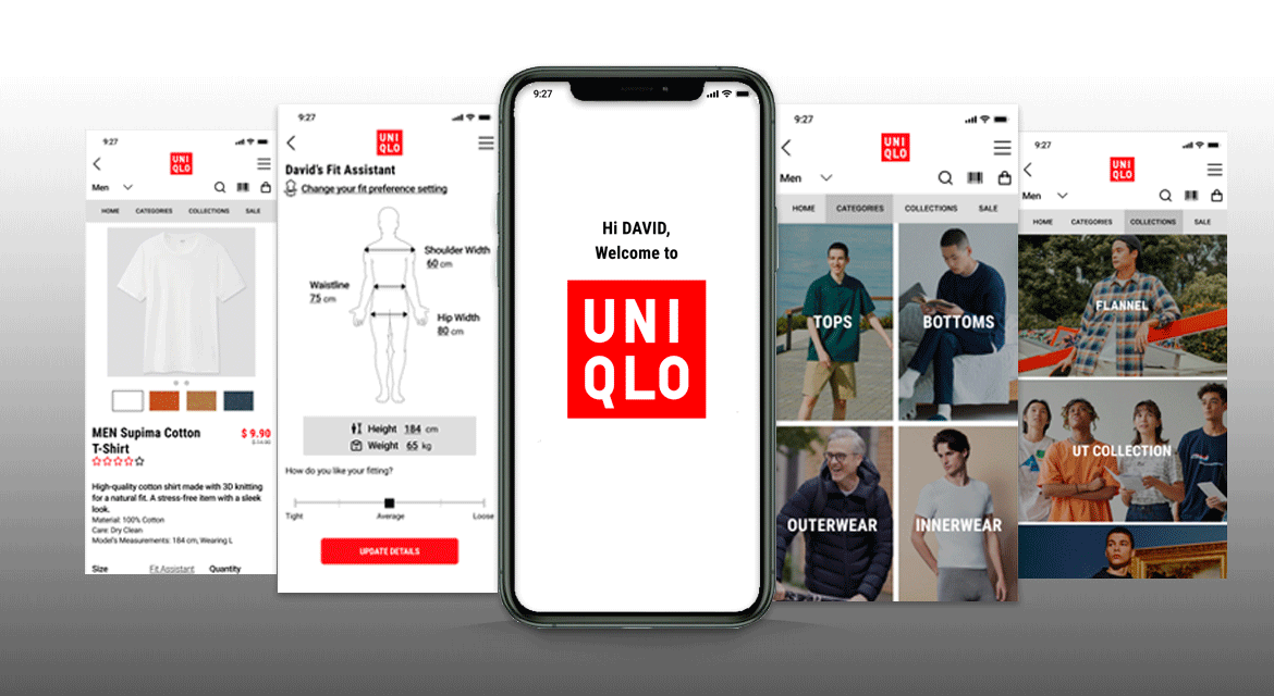
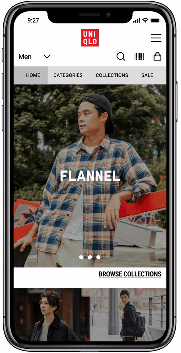
The new and improved UNIQLO App
We introduced the following new features that would eventually mimic a similar experience a user may experience in the physical store:
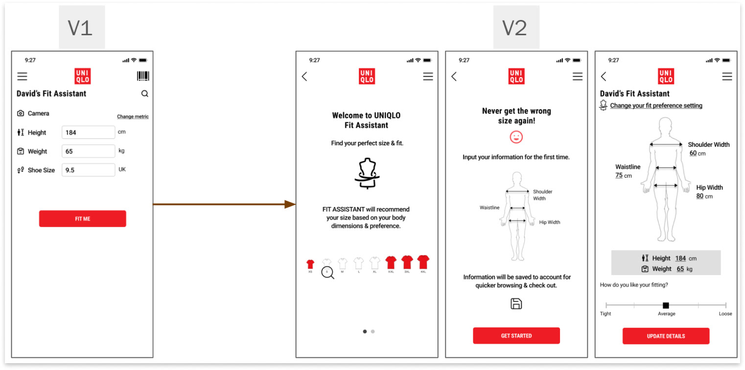
1. Fit Assistant
In a physical store, an unaware customer would be able to go to the trial room to try on a fitting of a piece of clothing. They may want to try multiple sizes of one item to see how well it fits their body.
In our UNIQLO app, Fit Assistant does exactly that. By entering the customer's body measurements, the app will be able to suggest what size will fit best for the customer.
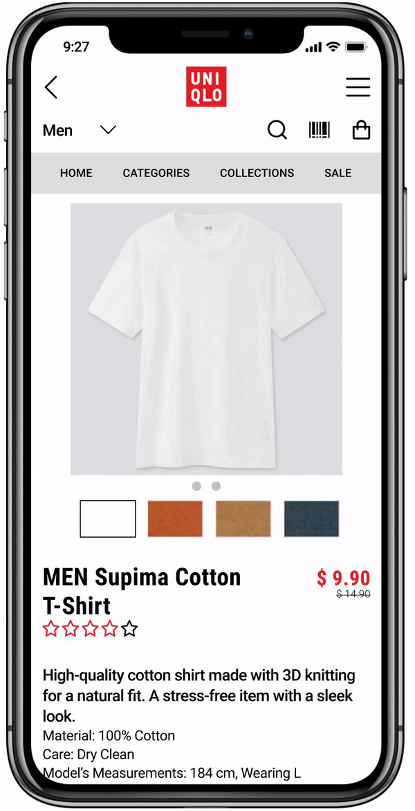
The user's body measurements and preferences will be saved in their account.
Now, any time the user goes into a product page and wants to select their size, Fit Assistant is readily available with the recommended size.
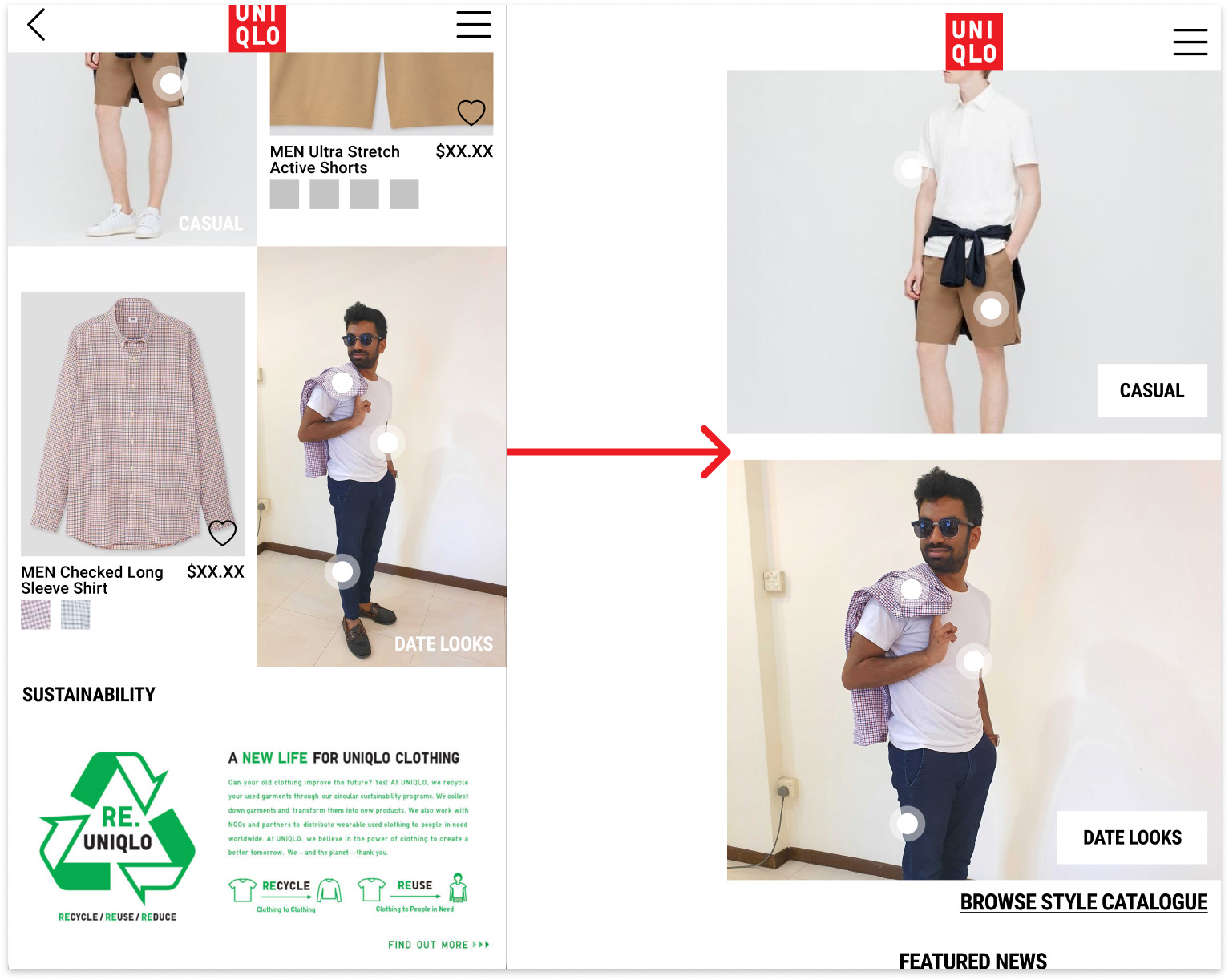
2. Style Catalogues
In a physical store, a customer walk pasts mannequins. These mannequins are dressed up with UNIQLO's clothes. They're usually carefully dressed up by the staff to create good looks and styles, that a customer might want to try.
The customer is able to find out about each piece of clothing in that style, by referring to the tag, and is able to pick the respective pieces.
In our UNIQLO app, a customer can head to the style catalogues for the same purpose. Once at the style catalogues, the customer is able to click on the hotspots on each piece of clothing in that style. These hotspots will allow the customer to head to that product screen, and add that item to the cart.
How did our app fare?
Testing | Iterative Designing
A round of usability testing on the current app with 6 participants had given us a good set of improvements to be made.
Two rounds of usability testing on successive prototype versions with 6 different participants provided us with valuable insights necessary for our design iterations.
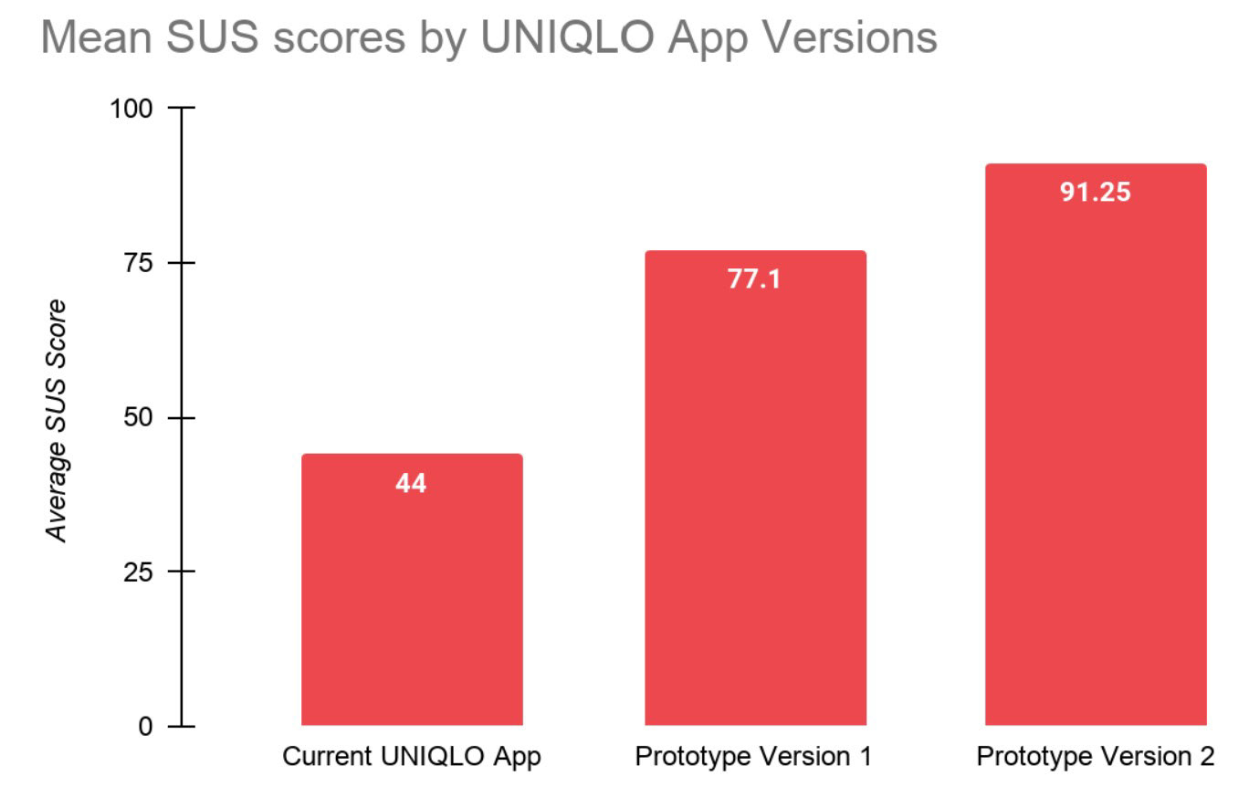
System Usability Scale (SUS) scores show a significant improvement over the current UNIQLO app.
They also indicate an on-going improvements along successive prototype versions.
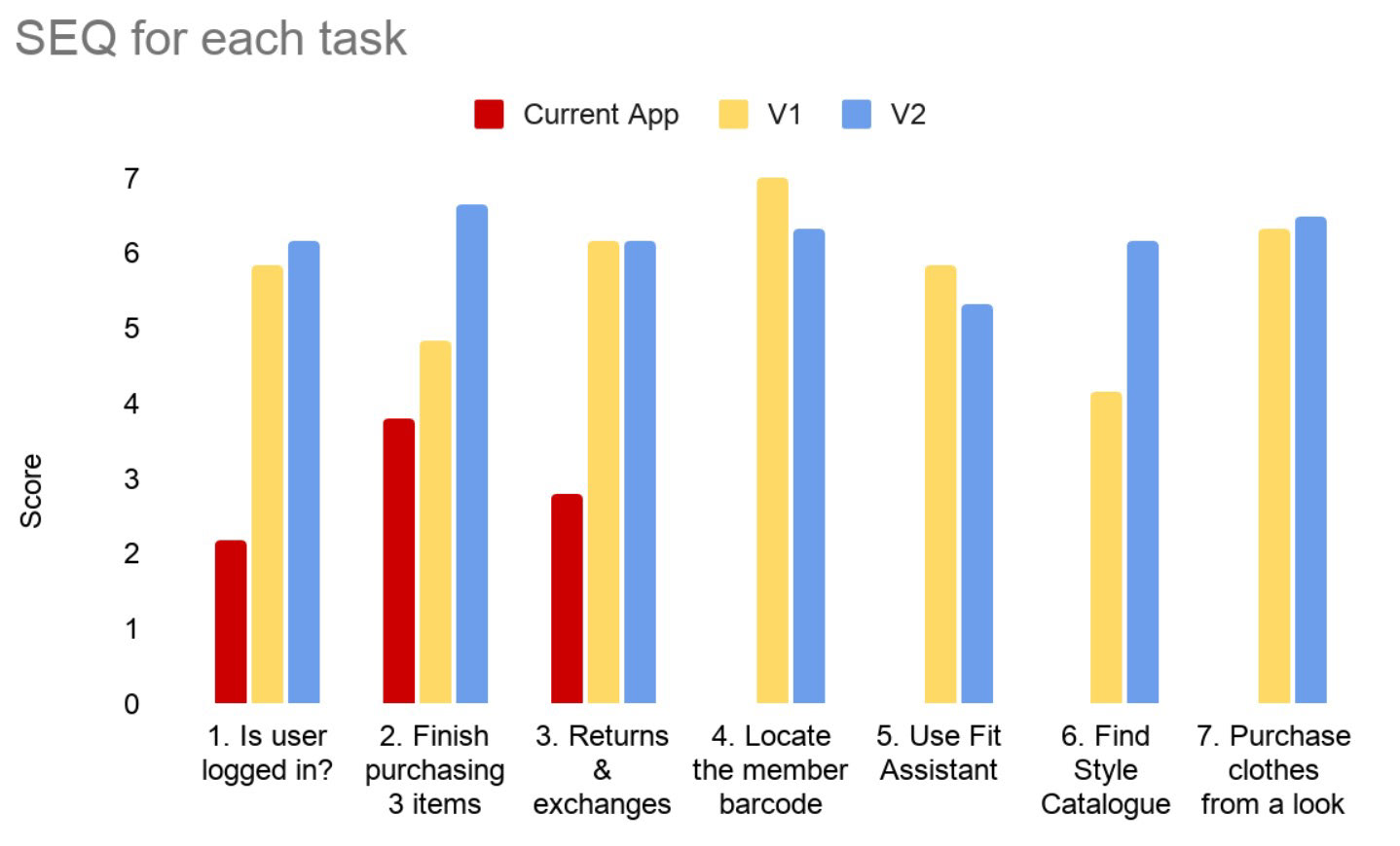
Ease of some of the tasks existing on the current app has significantly improved with the new UNIQLO app.
However, some of the new features being introduced have seen a drop in the ease of use. This is acceptable, owing to the fact that these are new features.
We think that over more iterations, ease of use for these features will go up.
Fit Assistant
Because it's new, many of the users could not understand the purpose of this feature. We figured that this would be true years down the road when the feature has been out there for long.
We added some on-boarding screens to let the user understand how Fit Assistant works
Style Catalogue
Users had a hard time spotting the catalogues on the home page, due to small model images as well as item cards right beside it. There was a slight overload of information
We decided to get rid of the item cards on the home page, and made the model images bigger.
We also made it clearer as to what kind of look is being pulled off by the model in the photo, and added a way to browse the full catalogue .
Other design improvements
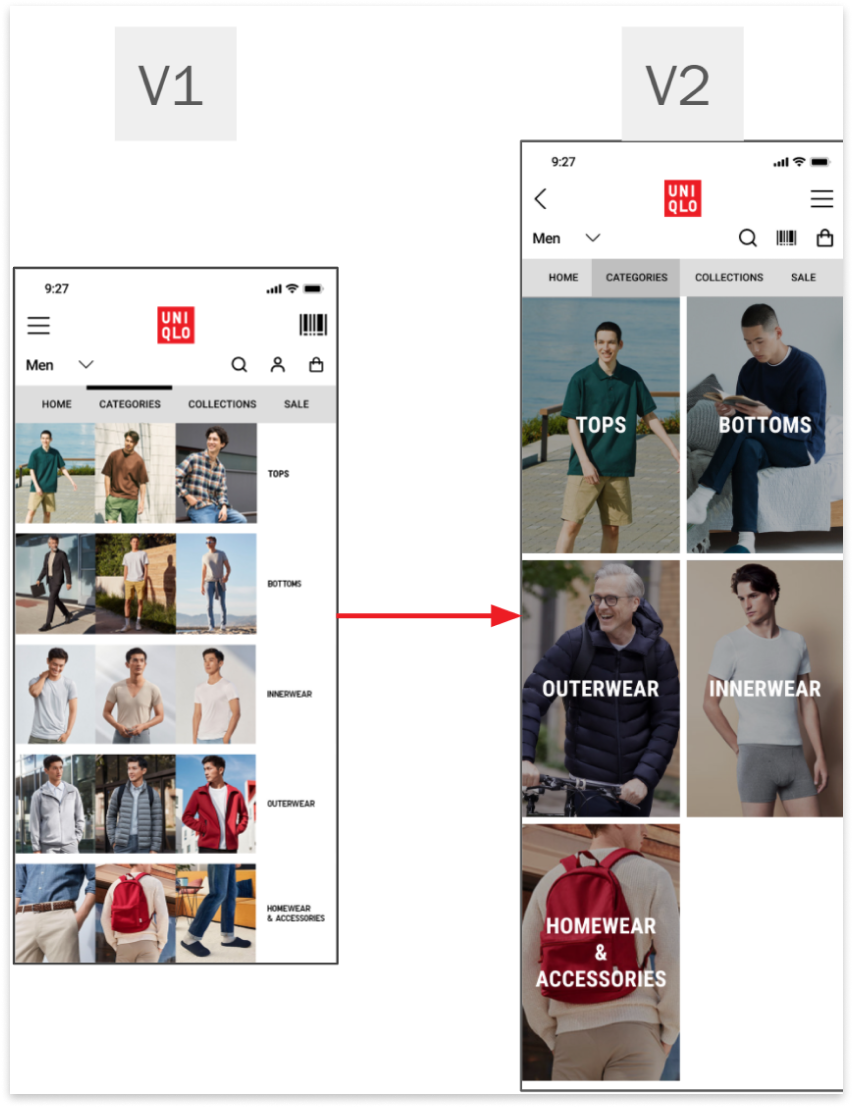
On the Categories page, we decided to reduce each category into a single image and title.
This was to reduce clutter and allow users to better focus on each of the categories.
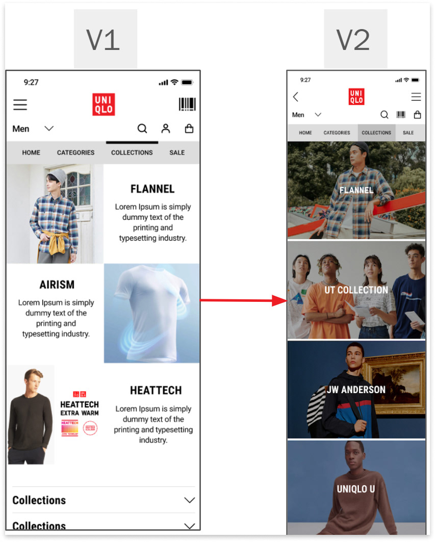
On the Collections page, we made important collections run the full width of the screen & we removed the descriptions.
We also decided to expanded accordion collections into images with descriptions
We did this to draw attention to featured collection and leverage on users' scrolling behaviours
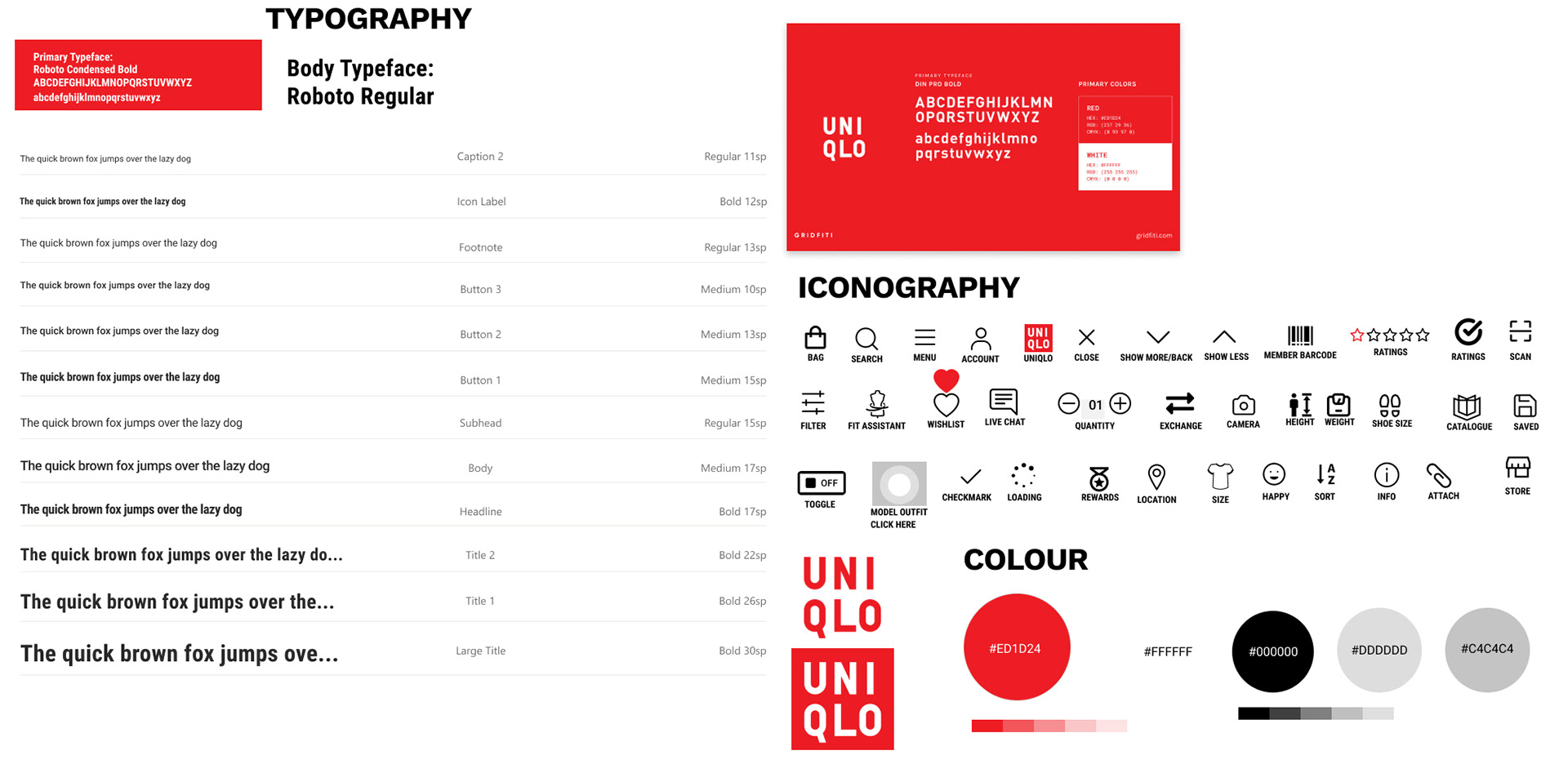
Building blocks
A Design System in the making
Final Thoughts
Working in a group had its own set of benefits and challenges. I was exposed to various perspectives when faced with certain roadblocks.
On the upside, the four of us got along so well that we didn't need to push each other. Everyone took up ownership of the group work, and we all contributed equally.
On the downside, we got along so well that we lacked special leadership that may have helped with some of the oversights that we had during this project.
I enjoyed working in this light-hearted, fun-loving group.